
The following is a guest post from Ennio Longo – You can follow him on Twitter here.
I wasn’t even aware that Juventus was holding a press conference yesterday let alone that there were introducing a new logo. I must admit, at first I wasn’t even sure what I was looking at and then it began to sink in. The responses from social media were so strong and mostly negative, Juventus fans feeling they had been betrayed, almost in a way embarrassed. Other teams mocking the modernization of the logo, correction, not the logo, but now the brand of Juventus.
Since 2010, management has hardly set a foot wrong but would this be their largest failure or is this a stroke of misunderstood marketing genius which will only be revealed with time? Quite frankly, if it is the latter, it would not be the first time that something so controversial at the beginning would morph into a success.
![]()
Firstly this is more than a logo, it is now a brand, something larger than 11 men on a pitch, it’s an extension of a football team that will encompass any manner of product, promotion and service. Therefore, why is it necessary to rebrand at all and why should this look more like an apparel or automotive company and less like a football crest?
Ten years ago, Juventus was a financial powerhouse, this was before the days of the ridiculous EPL TV money, before countries started buying football teams, before kit sponsorships approached the gross domestic product of a developing nation and before the Chinese invasion. The current reality of Serie A and football is very different.
Juventus lost a great player in Pogba this year to Manchester United. Despite what one might argue, the move, at least for this year was completely marketing related. There was absolutely no football reason for the move to happen in 2016. This is as much a referendum on the state of Serie A as it is on Juventus. Juventus has maximized their gate revenue, they do well with Champion’s League money but that is not a guaranteed source of income and teams must be able to increase their guaranteed sources. They operate out of a small town compared to the likes of Madrid or Chelsea or even for that matter Napoli and Roma. They are the best house on a not so great street right now as Serie A is run by an aging fool who has done nothing to modernize the stadiums or increase the TV revenue. Essentially they are on their own.
Juventus cannot be a city team of Torino, it must become a worldwide brand and not a worldwide football brand, but a worldwide lifestyle brand which opens up non-traditional revenue sources. There is a genius here that is being underappreciated for two reasons. The first is because some think it destroys the purity of the game. The second is because the reasons behind it are not fully understood or appreciated.
I think the purity of the game is a fluid concept based on a given time period. Things that people might consider not meeting the standards of purity would be; paying players, buying and selling players, players with long hair, players with tattoos, players with facial hair, sponsorship on kits, sponsorship around the stadium, Catholics playing for Rangers, teams made up of foreigners. If you read this and think that some of these things are ridiculous things, then remember at one time they were not accepted by the general football public.

To survive, thrive and grow change is necessary. There is a saying, the only constant in business is change. Changing what your brand means, what it is and what it encompasses. This has already begun; it just has a face to it. J Medical, J Museum, La Continassa, which is the area surrounding the stadium and might be entitled something else in the future that starts with a J. This is not unchartered territory; at one time it was called The Apple Computer Company. Computers now account for about 12% to 13% of their sales. The ‘I’ branding recognized the need to expand into new markets and as such the allowed themselves to no longer think of themselves as a computer company and instead as a media and communications company. This resulted in Apple changing the music business (iTunes), the animated movie business (Pixar) the communications business (iPhone) and the portable computer business (iPad). Did you know that in China Porsche is considered an SUV company that builds sports cars? Is that incorrect? I remember when Porsche was just about sports cars, but if they make more SUVs now then are they not that? The creation of the SUV did not take away from the 911, all it did was to help the company survive and infused it with enough capital so that it could continue to make the 911 and it has never been better. Juventus must strive to do the same.
So why the new logo. Continuing our comparison with Apple, could you imagine if your phone had this logo on it?
Would it make sense to have a computer logo from 1977 on an internet device in 2017? The new Juventus logo is no longer about the football team, it’s about the brand. An expansion beyond the pitch that must encompass everything it does and that it intends to do. Therefore, it must not only appeal to the core football fan, it must appeal to non-football fans.
Question; how many support the team because of what the logo looks like? It follows that if this number is very small that a change in logo a change in the branding will not chase away those who are there for the on pitch performance. What it will do is to invite new people and new markets in.
Juventus could not have strayed more from their traditional logo than the stylized J that they presented today…that is the point! Crests are very traditional, very football, but if you want to expand your brand beyond that, it needs a wider appeal. Will they brand shoes? Will they have a line of casual clothing and not just athletic wear. It permits them to expand beyond a football team.
I saw many ridicule that it took a year to come up with a J. Logos are not easy, but sometimes what seems simplistic is such because it is very well thought out. I don’t know but we will see. I do know they are in good company. That year would have been spent studying contemporary logos, understanding how they appeal to the product markets they want to enter, looking at how different geographic markets respond to design. Think now that we have a letter from the Western alphabet that has to appeal to over 3 billion people who do not use that alphabet. It is also a more social media friendly logo in a social media world.
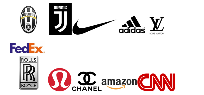
Examine the simplicity of the following industry leading logos and then compare which of the two Juventus logos would be better poised to take them to the next level.
Yes the bull is gone, which represents the city of Torino, but this is no longer about the past and past representations, it’s about the future, it’s about new markets, Juventus is not a Torino brand, it’s a global brand.
Ferrari, Juventus’ corporate cousin has embarked on a similar path in order to assure their continued survival and growth.
I can understand the backlash but I can also see why it was done. For those who don’t think it reaches back into the past remember what Gianni Agnelli said; “I get excited every time I see a word beginning with ‘J’ in the papers.”

85 Comments
I like it. I don’t like how it’s been used in the uniforms so far, mostly because I prefer if it looks like a patch, but I like it. I was a bit reluctant initially.. but if you look at it through an advertising/marketing standpoint, it makes sense, and it’s exactly what I try to explain to clients when I’m designing a new logo. This logo is easier to remember, easier to describe, easier to draw, easier to scale (up or down). It can be used aaanywhere, in any medium, in either black or white. Cheaper to print/embroider/stamp/burn/etch/mold/etc. Easier to tattoo, as well.. for those of us still lacking Juve ink.. 😉
He is not saying that the old logo speaks less, he is saying the new logo is better suited to be used in more ways then just the crest on the jersey. And when you say the owners must remember the roots, the roots of the football club is exactly why they did this. They are expanding the BRAND of Juve so that they increase revenue so we can throw ridiculous amounts of money at the worlds best players and continue to dominate domestically and hopefully be a constant in the last 4 of the Champions League. Wouldn’t it be lovely if Juve could throw the same kind of money that a United or Barca/Real can? Wouldnt it be nice to see two or three world class players come in the transfer windows regularly? We will not be able to do this without Asia/American backing. Sad but true, and the new logo has everything the scudetto,black and white stripe and the J. SImple but effective. LOVE IT
Yes, but unfortunately your argument is somewhat blown out of the water by the reality that Man Utd did not and have not needed to ditch their famous club logo to a new ‘M’ branding to become the biggest / richest football brand in the world! In fact if you look at Utd’s marketing logo it is a lot more intricate and messy than our old one. Not stopping them raking in the cash though is it. They have kept the heritage intact. So why couldn’t we? Perhaps the old logo was not marketed very well?
However Man U became a global force, it happened 40 years ago, Juventus are trying to do that in 2017. The forces that dictate success and prestige and popularity are different, we can not do what United has done because they already did it. If you took the word Juventus out of the old logo and showed it to a non football loving person they would have no idea what it is. My mother hates sports yet knows Real and United because they managed to do what Juve are dreaming of, become globally recognizable with just a look. And you are right, in the past nothing about Juve or Italian football was marketed very well so now we must do something drastic to catch up!
You said it perfectly right, United did not have to ditch their FAMOUS club logo. Juves logo is famous to footballers and lovers of the game, not a casual person which is whom Juve are trying to connect with.
I agree with Dar Black, he raised some good points.
I wrote this same question above, I’ll repeat it for the sake of the conversation:
What do you think:
Which group will be greater, the amount of people who purchase J branded
things because of being Juve fans, or the amount of people who become
Juve fans because of a J branded product?
Do you think the “casual person” will connect to Juve better, if they see a J perfume (or whatever non football related product) they like?
the number of people buying J related things because they are true fans will stay the same because we dont love the club for the logo we love it for how it makes us feel. the logo is an extension of that. People may very well become fans of Juve because they have a modern logo. I have asked many people i see wearing one of the massive clubs shirts why they bought it. the answer ive got 70% of the time was, “I dont know i just recognized the logo”. I dont think you realize how many people outside of Europe dont really know what Juve is. And to answer the second question, its not a matter of if they become life fans of the club, its that they bought the product and Juve gets the money. This change was to open more streams of revenue we keep mixing our emotional attachment with the old logo to the reasons for the change.
Think about this, I am from Long Island New York. If five kids from my small town only buy United gear because they recognize it, multiply that by the state and country. United makes millions just from people not knowing any other team, and they use this money to buy better players to keep winning. Its that simple.
” I have asked many people i see wearing one of the massive clubs shirts
why they bought it. the answer ive got 70% of the time was, “I dont
know i just recognized the logo”. I dont think you realize how many
people outside of Europe dont really know what Juve is. And to answer
the second question, its not a matter of if they become life fans of the
club, its that they bought the product and Juve gets the money. ”
@Dar black @ Peter
Beautifully stated!! In the US everyone knows about Barca, Madrid, Man U, and Chelsea…Not many know about Juve, ALso THOUSANDS AND I MEAN THOUSANDS of people buy shirts and jersey’s and even follow teams JUST BECAUSE of Logo, and shirt colors and design!!! and yes that includes people who dont like soccer, i have friends who hate soccer and just watch american footbal or basketball or baseball, but they occasionally where the jersey of Madrid or barca or chelsea or Man U because of its recognition, and because it is a nice looking sports jersey’s.
Do you think we could not have achieved the same kind of recognition with our old logo IF we achieved success in the champions league? Currently that’s our biggest exposure to the world. If we can keep players like Dybala, we can become as famous as Madrid or Man U, all we have to do is dominate when we’re being watched.
I’m no expert in (football) economics, so correct me if you know anything about it.
I believe, football teams receive their biggest money from TV revenue. Right now, nobody who doesn’t already know Juve wants to watch Juve, because (IMO) of our performances in the CL, and(!) on trivial games like friendlies in the United States. Yet everyone wants to watch Barca, because they know Messi plays there. In a couple of years, everyone will want to watch Man U, because everyone will know Pogba. If we can make our players famous and recognised either the way Pogba was made famous, or Messi (winning awards everywhere), we will get the same fame.
My problem is I don’t believe Agnelli when he says we need a new logo with this whole rebranding thing. I believe if we just kept the logo, we would be able to achieve the same kind of success with the things he’s been up to lately, given that our football team shines at the same time.
Spot on. If we had won the CL final our marketing value would have increased quite substantially, and perhaps we would not be having a discussion today about a new logo… For Serie A teams without the huge tv deals it is even more important to take the chances when they come. Easier said than done when you have Messi, Suarez and Neymar up aga you of course.
“Do you think we could not have achieved the same kind of recognition with our old logo IF we achieved success in the champions league? Currently that’s our biggest exposure to the world. If we can keep players like Dybala, we can become as famous as Madrid or Man U, all we have to do is dominate when we’re being watched.”
CAPS LOCK ISN’T ME SCREAMING JUST HIGHLIGHTING WHATS IMPORTANT AND KEY WORDS
You are correct, but everything is a big “IF” and 50/50’s :
– IF WE WOULD HAVE…..But we didn’t,
– IF WE CAN…But we don’t know and cant be sure that we will,
– IF WE CAN KEEP Dybala…We where all 100% certain we wouldn’t lose Pogba at least not at the time he left….and we did
– WHEN Dybala BECOMES AS BIG AS Messi…ok first Dybala needs to show that level of play in a consistent bases, and Messi and Ronaldo need to retire, or go to a (N/S American) or (Chinese/Middle eastern league), I SAY at the very dreamy/fanciful least 3 more years from today.
What do we do till then? What will happen till then?:
– OPPORTUNITY LOSS… We Will miss out on many young stars around the world, and LOOSE many of our own young Stars (like Pjaca/Rugani/Orsolini) or Famous Stars like (Dybala/Higuain/Sandro) To teams like Madrid.Bayern,Barca.ManU,Chelsea BECAUSE THEY ARE FAR RICHER than we are…And will be for the very least 3 more years. Even their les rich counter parts (Liverpool/Athletico Madrid/Arsenal/Spurs/Everton) Have more money than us.
– LOSS OF REVENUE… If we lose Dybala, we will lose A TON of revenue, he is now our money well, So should we ever start dominating Europe even without him, we will be in a weaker financial position, this is just an example about how many of your “IF’s” and “Maybe’s” can go the wrong way
– Exposure… We need more than just winning the Champions League once to get said Champions exposure and fame…How have the spaniards done it? How did the British do it? THEY where YEAR AFTER YEAR in the Semifinal(At Least), and in a span of 5 years, won the champions league AT LEAST Twice, Not to mention at the time of them doing so respectively, They Where/Are The MOST POPULAR League IN THE WORLD, and had the BEST MOST EXPENSIVE players in the world, at the time.
– THIS CAN NOT HURT… This is why I don’t understand the negativity surrounding this whole debate (Not just from you but from everyone opposed to the idea on this blog in general) .. IT CAN NOT HURT! Perhaps you and Dar Black and others are correct…Perhaps Dyabla becomes the next Messi within the year, And perhaps we WIN this Current Champions League, And perhaps we get said fame and exposure and money that comes with winning it…if that happens according to you guys this whole paradigm shift would have then been superfluous correct?….Well NO!! that would be the Best thing EVER! it would propel us in our goal; Understand this is a new marketing ploy that will:
A) – Potentially put us on par with the Spanish and English giants Revenue wise, WITHOUT NEEDING TO WIN ANYTHING! or WITHOUT FLASHY TV DEALS.
B) – If WE Win the champions league, and Dyabla becomes the next Messi and stays with us Forever we get all that FAME, Money, and EXPOSURE that comes with it + Revenue and Exposure from this new marketing Frontier. IT CAN POSSIBLY LEAVE US RICHER THAN the Spanish and British giants…how sweet would that be?
“I believe, football teams receive their biggest money from TV revenue. Right now”
OK good, reflect on that sentence..it holds true ManU just surpassed Barca and Madrid today in club richness precisley because of that…Juve dont get money from tv deals…That is why we are trying this logo change, and selling the Juve way of living and what Juve represents..Juve are trying to make that a bigger source of revenue than Tv deals….Will it work? It very well can…but we need to wait and see. LIKE Cory said down below “it doesnt matter if the new fans or people buying our products/jerseys/tickets become true fans or fake fans..or even like soccer at all”(Paraphrasing) what matters is that they buy our products and that we get our revenue…That is all that is important my friend.
As I’ve said, I’m not against the rebranding, I’m against this new logo, because I don’t like the style.
I think Agnelli’s goals could be achieved with whatever logo.
I’m still not convinced why we need the new logo. How is it any better, than what we had? Is there a list a new logo has to meet in order to satisfy the greater public?
http://www.bamsforum.com/see-richest-club-world-not-real-madrid.html
United is a great example to prove my point. Their logo is complex and historic. I don’t believe our logo change was necessary. Do you think we couldn’t have achieve the same recognition with our old logo, when the likes of United, Arsenal, Real Madrid, Barcelona could?
United is a great example to debunk your point, United, Real Barca even Arsenal for one reason or another are already instantly recognizable. you may not want to admit it to yourself but Juve is not at the moment. (in the markets they are attempting to enter) Understandably so, you are so firmly rooted with the clubs history and logo which represents that you cant see that the club you love is making history, innovating the game, trailblazing. People hate change, if you have read my posts and still don’t see how this change is a literal stroke of genius for the long term then only the results from this will convince you.
I do admit it, not in this post, but somewhere above. The only people who are watching Juve games, are those who already know Juve. Nobody else turns on their TV or stays on the channel, when they see Juve play, while they do it with Barca, because of the likes of Messi.
All these club logos have a long history. For example, nobody remembers the Arsenal logo without a cannon.
The core of my point, is if Agnelli keeps doing the rebranding work which he is doing, but he kept the logo, he could achieve the same success, IF and only if our team dominates when it’s most exposed to new potential fans.
Claiming that we needed this logo change to achieve the success, is not grounded.
I’m sure they will be successful with this, I just find the new logo unnecessary and a low quality effort.
I don’t buy it Cory, sorry mate. I don’t see how Utd’s past which up until pretty recently had less european cups than Juve allows them to get away with using their historical club logo to tie up a £47 million year deal with your boys Chevy, yet we have to ditch our old logo to compete? Clearly in the picture below the Chevy execs don’t give a toss about the fact that Utd don’t have a poncy meaningless logo like our new one with just an M on it! Did not stop pen being put to paper… https://uploads.disquscdn.com/images/2c8a0c4eea1d3321bd628d3b4b95a48e9ba6b36d7cc35935ed0dc0917a1e3ce9.png
Think about Chelsea – they have no history outside of England at all until late 2000’s! They still have their traditional logo which again is not as clean and elegant as our old one was. Yet they still signed a £40million shirt deal with Yokohama and a £60million per year deal with Nike for sportswear. All deals that are a multiple of what Juve have.
So here it is: The bottom line is that it’s nothing to do with the logo Cory. It’s the club’s international appeal and popularity based on television and other mass media *exposure* – and that is not going to change because of a silly new logo! It isn’t. That’s a fact.
Everybody who loves football knows who Juve are. But until Serie A has increased popular worldwide cultural appeal from better stadiums, competitive squads (and the end of ultra violence at matches) leading to increased TV coverage and viewing then nothing much is going to change I suspect for the clubs sponsorships. We will still get some good ones, fairly big infact. But they will not be equal to the ones that the top La Liga and EPL clubs can get.
Do we really think that any corporation that was thinking about sponsoring us for a few million and had decided against it, or was just on the fence undecided would really change their minds just because of that new logo? Really? Doubtful chap, really doubt it. We shall see in time.
Dar, Im at work and so im rushing my thoughts here haha. You make valid points, the exposure is they key here. (for the record i dont think our logo kept huge sponsors out) In my opinion Juve is trying to grow irregardless of what Serie A decide to do. They do not want their financial fate to be tied with a league who seems to have little interest in moving forward and growing.
Think about how much exposure the club has gotten in the last couple days because of this! again i am not talking about a person who loves the game, of course they know Juve. But for example the North East in the US is basically 50% italian. a HUGE HUGE majority have no idea what Juve is, and trust me when i say people around here blindly like and follow things just because of ethnic identity. Football will blow up in the USA eventually and this market and Asia is based more on apparel and functionality then history.
This change wasnt for us die hard fans, its for the 14 yr old from NY or where ever that is just starting to get interested in the game and he sees something that stands out, something thats clean and modern. the revealing party was named “black&white&MORE” the future of sport and entertainment is to be all inclusive, Juve is starting a trend that will be followed i guarantee it.maybe not with a logo change as drastic as ours or even have to do with logos but making football more than what happens on Sat and Sun. a legit brand. This is the future, and you cant stop the future because its already here,
MAn Utd, Chelsea and Madrid all did their mass marketing in different times, different times call for different marketing methods. ManUtd, Chelsea, and the Spanish giants have no need to change their logo or anything because they are far to rich and dont need to. They get the millions because they are already recognized by the international community! Faggots like Justin Bieber like chelsea just because of their fucking crest and jersey colors, not because he knows anything about football, And just because he likes chelsea, 3/4 of his fan base now likes chelsea…now do you understand??? ManUtd, Chelsea, Barca, and Madrid are far far bigger clubs than Juventus; And that is just because of global recognition as a team and as a brand. they dont need to rebrand their crest, and what got them millions of fans here in the US was something very Trivial! Here in the states people who know jack shit! about football…they dont even know that the keeper is the only player allowed to use his hands…Yet they know about Barca and or Madrid. Again these clubs have no need to rebrand or market! their games are showed all over the world! and have a ring of power and prestige and dominance that juve dont have! Juve is the only club attempting to market globally after models that have worked like that of Apple and nike. If more teams try to do the same, they to will have to re brand their logo like us, But for now juve is the only one, and that is why just them, and not the others.
I also see the reason behind the new logo. I just don’t like it. I’m not sure if this is necessary at all.
I believe the writer’s choice in company logos are text book case of cherry picking. That Apple logo was used for 1 year after the company was founded, and after that, they used a pretty consistent shape ever since. So this one is clearly a bad example. Apple realises they must not change the form of their logo, but they can play around with the colours a bit.
Apple didn’t change their logo when they started meddling with Pixar, or when they came out with iPads, or iTunes.
You should also mention “small, irrelevant” companies which didn’t really change their logos over the years for whatever reason. Take a look at BMW, Volkswagen for instance. In my opinion their logos are as complex as Juve’s previous, yet they still decided to keep it.
The logo they came up with, is okay if you want to make your company compete with Adidas and Nike. If you want to compete with Real Madrid, Barcelona, Bayern Munich, and so on, you need a football crest.
I just don’t understand why they decided the need for a new logo. They could have just change the font on the previous one, so their ‘J’ brand thing could go on, while you also keep fans happy. Sort of.
Good article,
However, I believe you need to get an even bigger picture to understand the change.
The truth is that football is becoming less about football and more about a holistic business.
A few years ago (to us older fans) you could pass the ball (with your feet) to the goalkeeper who could legally pick it up. It was about the same time when there was a limitation on foreigners in leagues. Since then we have seen “plastic” buying clubs rise, we have seen clubs selling anything stadium names to their colours, we have seen TV producers planning football calendars, Fifa representatives / highly respected footballers (Platini aka a Juventino) sell anything for the sake of money.
If you want to understand the new J, then think of what has happened to football in the past 10, 20 or 30 years. It has been streamlined into a smooth business that focus on profit.
Personally, I find my love for football fading slowly as it becomes totally exploited and overexposed. Money is tearing on the uniqueness of our game, so much that we trade our crest for a brandable logo.
To me this is the real issue. That us fans, real Juventinos, are watching our lady transformed from something that was ours to something that can easily be everybody’s.
Gone is the identity, gone is the special relationship, gone is the special feeling.
When we’re talking about the representation of a brand I actually love the logo, but when I look at it as the symbol of a historic football team I just can’t help but feel frustrated with the change.
Unfortunately, and unless the marketing strategy results in a total fiasco, I don’t see them changing it back any time soon. So, I resigned myself to the fact that football is no longer (and actually hasn’t been for a long time already but I was just too stubborn to face it) about history, heritage, prestige or tradition but it is right now a business and as such, the only thing that matters is the money and how you can get more and more of it every day.
Everything changes and there is no reason to think football shouldn’t, perhaps I was clinging to much to the thought of a Juve returning to the European Olympus while at the same time attracting new and established stars just with the help of only our sporting success, merits and reputation…but I guess that was me being wistful and romantic.
Seems like we think a like
The decision to rebrand a part of Juventus identity is a step backwards or at best sideways, but not forward.
Management should be thinking of replacing Allegri instead. I think he has accomplish everything he can at Juve and it is time for him to seek a new challenge somewhere else.
i agree with your second point, but not your first, re read the post with an open mind, it makes all the sense in the world
I would swap Allegri for Wenger at anytime.
Even though he is miserable at transfers, he has always been a great coach.
A few other options: Eusebio di Francesco, Sarri, and even Spalletti
ok i do disagree with Wenger, Yea i rather keep Allergi if that is the option, He has done nothing good at Arsenal recently, and yes he is very very stingy with his money. I wouldent mind Spalleti or Di Francesco
Disagreed on both actually. The logo change wont harm Juve in any way, they can only gain by it in new markets.
Concerning Allegri, he still has a CL to win here and a record 6th consecutive Scudetto
https://uploads.disquscdn.com/images/9765fb009483e37778e7cb494289b8dbf13288ec409fa99441dae90009cf4dbd.jpg
How many new logo varients are there?
i think this one is just fan made logo, not the official one
Shame, it’s better than the official one. I don’t understand why they did not utilise the J hook to put the old logo in or the bull like this one. Much smarter.
The original logo is too simple and looks cheap, i dont know what they been thinking about when came up with this such a crap.Maybe there will be some cosmetic change, lets hope for it.
The crazy thing about fan made variants is the fact that every single one of them looks better than the one they came up with.
Madrid doesn’t need an “initial R” or a simple drawing of a crown, Barca doesn’t need an “initial B” or a simple drawing flag of Catalan, MU doesn’t need an “initial MU” or a simple drawing of a ship or Devil’s fork, to brand them self into three most recognized football team in the world.
Yes today’s football is business. We all understand the club need money. But can they just focus to win the game? If they keep winning, the people with their money come. Look what happened in these 5 years. Juve dominated Italy, kept their enemies shut their blabbering mouth… and they became a rich club among losers. Sure management did their job greatly, but i’m sure they won’t achieve any of that without the club winning. So keep it simple. Keep winning.
“Examine the simplicity of the following industry leading logos and then compare which of the two Juventus logos would be better poised to take them to the next level.”
But they’re a football team. Put their crest on phone, on shirt, on shoes, who cares, fans will still buy it. They’re targeting people who don’t really into football/sport? Really. Just think about it, how many of them? If they want to sell the merchandise, then just do it, why bother change the logo? They concerns that their logo might scare people off, then just don’t use the crest, put something else – simple design appealing enough for cool people. If people doesn’t into sport, then they will just “meh” however great the brand, the logo is. “Wow great logo… but… it’s a sport thing, so… meh.”
” Madrid doesn’t need an “initial R” or a simple drawing of a crown, Barca
doesn’t need an “initial B” or a simple drawing flag of Catalan, MU
doesn’t need an “initial MU” or a simple drawing of a ship or Devil’s
fork, to brand them self into three most recognized football team in the
world”
– You missed the whole point of this post …re-read it. Also those teams are far far richer and have much much better marketing and international tv deals abroad
“But they’re a football team. Put their crest on phone, on shirt, on
shoes, who cares, fans will still buy it. They’re targeting people who
don’t really into football/sport? Really. Just think about it, how many
of them? If they want to sell the merchandise, then just do it, why
bother change the logo?”
– again you missed the point. “They’re targeting people who
don’t really into football/sport?” you said that as if it didnt make sense and it makes perfect sense! Football is stil not as big in Asia and the states as it is in the rest of the world, if anything can help that it would be more logos like juve’s new logo and marketing tactic. this is sheer genius! The italian league is honestly shit, it has now international recognition whats so ever! juve can be italian champions in a row for 20 more years and they will have about the same following, what does make a lot of noise? yea the champions league! how many times have we eon that in rescent history? yea, so thats why juve isnt as popular, not to mention a loss of stars: Pogba, Del piero, Pirlo, etc.. Dyabla is a new rising star but he still needs more time to reach a Messi or Ronaldo or Pogba or Del Piero world recognition.
I missed the point? You missed the biggest point of all. JUST WIN THE DAMN GAME.
I’m not only talking about Scudetto. those 5 years i wrote above, was just an example. Just by dominating in Italy Juve can become THAT rich. We fall behind those 3 clubs, sure. By far? Not that far. The management did a great job, keep it that way.
Sure Seria-A is shit. Sure Juve didn’t win the UCL. But that’s the point! WIN IT, FOR GOD’S SAKE. You win international cups, you get the recognition. Focus on that, why the logo? There’s nothing wrong with the current logo. It’s already one of the best football logo in the world, recognized by many football followers. Just think, with all this commotion, it won’t happen if people around the world didn’t know what Juventus is. They KNOW Juve. Don’t act like these backlash came from Juventini only. They recognize the logo, and they think it’s better than this fashion consumerism modern cool logo.
Did you really suggesting people will be fans just by the logo and the fashion? It could happen tho, but oh boy… Most people like Madrid, Barca, MU because they win a lot, or because they have worldclass champions in their team.
It’s the same thing with Juve, these past 5 years i spotted many people in my country (Indonesia BTW, one of the largest football loving country in the world) started wearing again the colors like the years before Calciopoli. Oh yes, Serie A teams followed by most Indonesian back then in the 90’s before EPL took the stage in early 2000s. In fact, Serie A influenced many football culture here in Indonesia. Many local club supporters use Italian terms in their activity, for example. The fanbase booming especially after Juve reach the UCL Final the last time. Look that way, those people like Juve because they’re winning. They have worldclass footballer in the team. Call them glory hunters if you like, at least they know what they follow, a successful football team. Not just a fashion show.
You said football is not big in Asia, damn you know nothing. You think asians do what? Karate, kung fu, tae kwon do? Contrary to what you think, Asia countries is the BIGGEST European football market.
But in the end, you shall not have any worries. It seems people here in Indonesia like the logo very much. Hurray! I am one of the minority. I dislike the new logo, but what i can do?
Great to get some perspective from one of the markets likely high up the list of target audiences! Cheers for your comments, comrade.
Porsche’s case is how we wish this would turn out. The release of “aberrations” like the 914, 924, 944 decades ago grew sales by over 50%, and subsequently the Cayenne and Panamera have multiplied their customer base. The original brand loyalists are now the minority, and I think that is what we’re looking for here.
It doesn’t matter what we relative few loyal Juventus supporters think of a logo if it opens the door to relatively more massive markets. This new logo is absolutely brilliant because it can be adjusted to any color combination and easily animated for digital media, and it does not scream “juventus” or even “football”, allowing us to multiply our merchandising revenue many times over. This means we get to keep the future Paul Pogba’s that may come our way. Which is good for us relatively few diehard fans!
People are acting up about “tradition” when the club has never had the same crest for more than 13-14 years at a time. I remember being furious about the crest switch in 2005 because it looked “modern” and “cheesy”, like an NBA or NFL logo rather than a proper football crest. I feel a little disconnect aesthetically this time around, but at least this change is actually about growing the club’s revenues and, as a result, the quality of the team. I have to admit that outside of match kits, I have never purchased merchandise because the Juventus crest felt like a cheesy thing to wear on a t-shirt or cap. This logo will change that for me because I will feel like less of a walking billboard or fanboy; imagine the difference it could make for someone who is not obsessed with this club. I feel that is the point many people are missing here. Our team will only grow stronger. This is not the end of our heritage, but rather our first step towards ubiquity.
new juve away kit https://uploads.disquscdn.com/images/505cefb1f44a77f295f76b3122e8aa6025e9c6b8c296a7302da49c064a5536ed.jpg
Honestly, that shirt doesnt look bad imo
looks fantastic imo
Is it something official or fan design?
Sure it’s fan made, I can’t imagine Jeep agreeing to a smaller spot than what they have right now.
Good point mate
i think this is official away kit, but not sure.
WOW! a true beauty
A great article and some superb, well presented opinions below…
Firstly, I must contest the suggestion that there was absolutely no football reason for Pogba to leave last Summer. Whilst the allure of the glamour and english culture of the rich, popular and famous played a huge part in the move, as did english culture in general wherein a young man can find a far brighter limelight to match his youthful eagerness for attention and to stick out from the crowd, drench himself in glitz, dance with Stormzy in the clubs…there were very clear footballing reasons involved in the decision. Firstly he had the chance to work with one of the best managers of all time and one of the best strikers of all time. Yes yes! Of course the two might be there next season, probably will be, but Zlatan will be a year older, and you just never know with Jose, he might be gunned down if a run of results don’t go his way and he reverts to the capricious brat he has been prone to in recent years.
There was also the pull of a club which whether sincere or not Pogba mentioned as the first family he had known as a footballer, where he wanted to return. Which is something of a footballing reason.
Lastly, there is the generally held opinion that the premier league is the most exciting football league on the planet, by far the most watched. It is fast, less defensive, open, flowing…very unlike Serie A, which has opened up, with Napoli, Roma and Sassuolo and Atalanta of late moving far away from classic catenaccio, besides which, the league is still far more defensive, the defending is of a much higher calibre. More space is allowed in the middle but far less up top. The pace is generally slower.
In short, there were plenty of footballing reasons for Paul to move, where he did, when he did.
The report would have made more of a compelling argument – yet required another 5000 words! – to elaborate on the Juve project which has been put in motion over the last few years. It goes well beyond the current rebranding. J-Village is a massive project, which will include an international school, hotel, state of the art training centre (J TC). So we best become familiar with such terms as J-Hotel. J-Restaurant. J-Medical. As they spread far beyond Turin and Social media…
I am glad for the apparently large reaction online to the rebranding episode, for that is the first aim of the marketing campaign. All publicity is generally good publicity for a product. The more who see it the better. So on that score the company are doing fine. Note I say company. There is a still a club, and it has the same roots and lo stile juve has not vanished into the J-Vault (just yet!). However Juve as a club are run as a sporting element of a company, with the aim being to succeed both on and off the field. To succeed on the field we need to raise our revenue, in fact even to continue to complete on the field anywhere near the top level we need to raise our revenue. Despite the amazing work Andrea Agnelli has presided over, and the success achieved both on and off the field, we are facing competition for players, which essentially win you success, from mid table and even lower ranked teams in the PL (and China!) because they can offer the players staggering amounts of gold…and a bigger platform.
On one hand we can say we have no interest in a player more eager for Stoke City than Juve just because they will earn an extra 2m per year. Which is fair, yet to play at Stoke for a year in the biggest shop window on the planet in the most exciting league, can also be seen as a logical stepping stone to both greater riches and greater glory.
The Beijing routine is not quite the same story…that is simply focusing solely upon money. No sporting glory or achievement, just money. In a culture alien to most but the orientals, with stadiums haggard, pitches awful, the standard of football appallingly low. That is for another discussion.
Essentially we cannot continue to blind ourselves to the financial realities of the modern game. To continue to seek success in a footballing sense, we need more money and also to keep up with the Jones, as the modern supporter is a different breed to assuredly those of Dar Black’s and my own era. Different to even those 5- 10 years younger than us I assume. Yet at the same time I will say that I find even on here, at times, on occasion, a very different kind of ‘supporter’ to myself, hints of this odd assumption that Juve should win every game, be the best in the world, basing discussion on statistics rather what is seen and felt by the gut and head…Just signs of the times. We live in an era where the young guns especially demand everything NOW NOW NOW at merely the stroke of a finger across a screen, and if they cannot get what they want, they wail, whine, bitch, or go elsewhere. Usually stick around as its all about ME ME ME…Selfie sticks morphed into forum rants.
Unfortunately we need to tap into that crowd, which is a market. We need to appeal to the cool kids of mong. For if we lack their support, it will go to a rival.
The rebranding is of no shock or major bother to me personally. It is part and parcel of attempts to improve our revenue and brand awareness globally and continue our progress towards remaining in the global psyche of supporters positioned as part of the elite, part of football royalty, not just of yesteryear but of now and for always. I do not see it as a death knell for the purists flagging interest in the sport…
We still have players at the club who would die for the cause. Admittedly this has been seen less often this season, but this campaign has been a weird one. So many injuries all over the first XI, tactical oddness from Allegri, barely any form, a stuttering, haphazard season, yet we have done enough, as the squad created on the back of our amazing success on and off the field these last 5.5 years is not united, not blended, but stronger than many believe. The stats fans should be happy with our position, both in europe and domestically, but for me, its the performances as much as the victories that matter. The former have been horrid so often since the Summer, and it is this which bothers me far more than a new logo to help promote the club to the younger generations of potential fans.
In a football sense…we continue to invest in the very best italian potential found domestically, most recently Caldara and Orsolini, we continue to retain a core of italians in our squad and starting XI and we continue to be run by the same family, an italian family of course, which have owned and managed the club since 1923. Our roots remain the same, the gate to the garden may look a little different though.
I agree that A. Agnelli is looking at the bigger picture and looking way far ahead than any of us mere mortals. Both Elkan and Agnelli know business trends most of us completely ignore and if anyone knows how juve will fight back the english and chinese worldwide push and hordes of cash in the next few years is them.
Still that doesn´t mean the logo couldn´t have been redesigned involving the fans in some way, counting on us and allowing us to have voice at least.
If the corporate image redesign is all about avant garde business trends, empowering us consumers (us Juve loyal fans) and letting us be part of the project in a more meaningful way besides just spending cash to attend games or buy merchandise I think would be a very advanced policy and would acually encourage more empathy, and a TRUE sense of identity with the brand/project if we actually felt our opinion counts even if not individually but at least as fan base as a whole.
It is not like you are creating a brand/company from scratch so that it just doesn´t matter what you come up with because people have not built any expectation about you whatsoever.
For management to pretend that to be the case with Juve would equate to try and hide the sun with the index finger.
I would be concerned and feel odd, if the club had been sold to a chinese investor or Sheikh (though comrade Gaddaffi did have some sizeable shares in our club prior to Clinton and Obama, with help from Sarkozy destroying him and his country…indeed, I wonder what happened to those shares?)…but a small patch, small emblem, on the shirt, on club merchandise, really has little to do with on field matters as far as I am concerned, and its the on field matters which concern me.
Andrea has a strong marketing background. He has overseen a steady, significant rise in our revenue and I retain strong faith that he will continue to do the same.
Seb, of course it matters what the fans think. Yet there are likely millions of others like myself, who bear only a passing interest in a small section of the shirt renovated and updated to meet what intelligent marketing deems for the best for the club. There would have been key community engagement with the markets we intend to embrace and hope to blossom.
The shirt still looks great to me…in fact the away kit seen below seems an improvement on our current design.
They do indeed know business models. One of them is taking Exor hq to Amsterdam from Italy to avoid paying tax. That business model is really popular with most of those at Davos this week. Bless their little billion dollar socks.
“J-Village J-Hotel. J-Restaurant. J-Medical”
This made me thinking. Will we also see a day, when we have to come to terms with “J-Football Club”?
The interesting thing for me, which has risen from this melee, is that we sold the naming rights to our stadium to Sportfive, for 75m for 12 or 15 years, I cannot recall which…they also had the job of marketing the VIP boxes. There were some conditions attached, such as no rivals to any of our other main sponsors, and a dividend to Juve after a certain amount of income, but the bottom line is…they have found nobody! So they must be making something, assuredly, from a 75m investment…but what of the stadium name?
Yes, you jogged my memory on that too GP. The stadium naming rights were flogged off, but if there is any answer to this it may be that they have kept a subliminal link to the Jeep sponsorship by leaving it as J stadium. I could be wrong, but it would kind of make sense not to dilute/mess with main club sponsor and the whole J thing… Btw, with Jeep being part of the Fiat / Exor empire and the undoubted tax benfits of ‘self-sponsoring’ within an internal organisation structure I am expecting to see Jeep as our sponsor for many years to come.
I am tired if the J thing tbh…. I think we are on course to trademark the letter J.
I don’t mind that, it’s risky, but it could work. I just don’t think the logo has to do much with Juve branding everything they touch “J-Something”.
I hear there will be hotels restaurants all around the world with the J symbol. I am certain that what we see is just the tip of the iceberg. Imagine if all great clubs will follow suit. Imagine if this come true. Imagine a friend were are we going?? To the J restaurant. Imagine the kids opeining their meal with a J surprise. Imagine what are you wearing. A J jeans. A J shirt. Would that detract from the football team. No.Welcome innovation. We already own Italy now we are going for the world.
What a ghastly apparition. Ronald McJ Burger ffs.
I appreciate your long, well-written comment, but I think you need to respect other people’s opinions before casting doubt on how much fan of Juventus they are.
Judging by the way you express yourself, I would say you’re above 50 y.o., which means you have been a Juve supporter way longer than me and most people around here, but that doesn’t give you the right to look down on younger fans by referring to them as “supporters” (the quotes added by you). The fact that you have been watching this game for longer or that you are contempt with the wretched way the team has been playing this season (as long as the results are there) doesn’t make you a better fan!
hohoho, I am 38, old bean…yet I suppose it is fair to say that in terms of a connection with some of the younger generations, indeed I feel either decades older, or a different species entirely.
I do not believe I suggested I was a better fan. Different, yes, as football is different now to when I was a nipper, mainly the manner it is presented, and yes also the way it is ‘supported’.
A juve supporter could have been following the club for a year and be 19 years old and I could find him or he the same kind of supporter as me. It is possible, just unlikely. People are to some degree always affected by the culture of their times. And it is impossible for a youngster to compare football culture of the 80s and 90s with the 2000s and now, because they didnt experience it.
i have the right to call a mong a mong. As do you. And yes the hollow, manufactured stereotypes, the homogenous idioicy of the many appalls me.
Most humans, in the West, gather their way of behaving from a media designed carefully to herd, to encourage unwitting obedience, to instill tribalism and manufacture conflict between and most importantly to curb any semblance of critical thinking.
For example, you tell me I am lacking respect on other’s opinions, whilst expected me to respect your opinion of others…can you see the absence of balance there? You have taken the word ‘different’ and exchanged it for something far more negative. Again, this returns to the idea of a lexicon governed by conditioned triblaism…Different is an insult to some people. As it weird. Something outside the norm…but why? Because to step away from accepted tribal behaviour, is to be looked down upon, made into some kind of pariah…
Indeed I am the kind of chap who cringes and snarls when I see people walking around with selfie sticks, oblivious to the others wishing to use the pavement, and to amuse myself, i ponder seeing their last moments on facebook as they wander into the middle of the road and are smiling and waving into their little screen of ME ME ME live feed to fuckbook as a tram mows them down! It is all part and parcel of people saying ‘hey you, look at me!’…I saw a loose friend post on social media last week a variety of photos from her engagement. They had taken a friend with them to take pictures from different angles, different poses, different smiles, you know…to frame that special moment when two people look into each others eyes, hearts and souls and commit to mutual devotion, true entangling of all they are and wish to be, for the rest of the earthly existence…to then be shared on social media within minutes…honestly, i find such cretinous behaviour that of a different species…yet I am a romantic, twisted, mangled, prone to harrowing cynicism, but a romantic at heart…which transposes to my love of football.
I’m having a hard time justifying that new logo. It’s horrendous.
They’ve gotten it all wrong. Massive mistake on their part. Change the logo? Ok, but that’s the best you could come up with?
This Juve management has done amazing things the last 6-7 years, but this is by far their worst decision yet, whether on or off the pitch.
I can’t justify it, I’m sorry. I just can’t.
Completely out of this context, but worth an article on its own. Have anybody read about this?
http://www.independent.co.uk/sport/football/news-and-comment/marco-van-basten-fifa-plans-change-football-a7534186.html
“Maybe the player should start 25 metres from goal and then you can dribble the goalkeeper or shoot early,”
Terrible idea. I believe the yanks used to adopt just such a system. It is a fundamental change to the game and one I am very much against.
The idea of playing less games and moving straight to penalties is less of a concern.
The way to curb the lean towards a handful of clubs dominating every competition is to more seriously enforce financial fair play measures. Platini was as dodgy as anyone before him, and its slightly cringeworthy to be reminded of his antics as whilst I did not witness his glory in our colours, he was a superstar for Juve during his playing career. Still, he is french…hohoho!
Making the game more entertaining does not curb the richest clubs continuing to dominate and suck up the majority of the revenue. Offering very little trickle down effect, other than to the premier league clubs. How they might be affected when Brexit comes is open to debate, yet the rich will still be rich. Still…it might possibly change matters. We can truly have no idea as no predictions of the pound seem to be accurate, from all the experts.
The problem as Juventini comes when entering the debate of any antipathy towards the nouveau rich, is that we support one of the richest clubs in the world. Just because we are not as rich as a Man City or PSG does not mean it is proper to suggest they have bought through success, or semblance of success. We have done the same. The Agnellis are pretty much on the level of dukes and viscounts in Italy, which is why we have always been near the top or at the top.
The finest words of Van Basten I read of late were focused on the Milanese clubs becoming owned by orientals. He also offered some words on the decline of Serie A…
I read that he proposed 10 new rules:
1. No offside
2. X max numbers of free kicks before players are sent of for a period of time (like in handball)
3. Effective playing time 80 min. (Like basketball)
4. A yellow card = time outside the field
5. Penalty kick to penalty chance/run (like Ice hockey)
6. Only the captain can talk with the ref (like in rugby)
7. In case of extra time, two additional substitutions are allowed
8. Less games
9. Less players per team in youth teams
10. Free substitutions in youth games
On one hand I appreciate if football is made more attractive, but in the sense that we eliminated the ugliness. For example, in handball when the refs whistle, the team with the ball has to place it on the ground and move away, otherwise they get a penalty such as 2 min. I believe in adopting such things so we don’t have to watch football where players run with the ball for 20 meter in their hands, only to throw it in another direction when a team could quickly have started the game again with a free kick.
With that said, I as mentioned earlier, I don’t want football to lose its uniqueness in order to satisfy the masses. Football is entertaining and surely it can be improved, but not by sacrificing the complexity that allows small teams to beat bigger ones with the right strategy.
All in all, it seems we are in for some changes.
Well put, mate!
yet…I remain wholly lacking support to any significant changes to the game as it stands. I still love football. I still love Juve. I still watch every juve match, and MOTD without fail every weekend. I have no interest and feel no need for the game to be made more attractive or exciting, for its already insanely popular, hence why the money from TV rights is now equating to the GDP of small countries!
The officials could be improved. Yet not through extra referees, just better referees. I am a purist, and idealist, also a realist and see any changes to ‘make the game more exciting’ simply another marketing tool of the media moguls, hoping to tap into new markets. Leave the rules alone. The offside change was a big one (deemed not interfering with play), as was the free movement of players out of contract. Video replays for a third ref is not something I like…The more fluid we can keep the game the better.
As a spectacle, it surely ranks as the number one most viewed sport on the planet so I feel van Basten is focusing on the wrong area. Its the money matters which need to be addressed. Not the rules.
I find it hard to support even less games, as I love watching juve play!
Better officials and more serious financial fair play measures are my only personal ideas to improve the game.
I’m kinda late to the party, but i was kinda shocked watching euro 2016. All teams were only defending with the final as highlight of it all. I nearly fell asleep. While that should have been one of the most exciting matches of the year.
Not all of Van Basten’s ideas are good but some of them might make the game more fun. But maybe i am wrong and the game will be ruined. It’s a tough decission.
im totaly up for canceling the offside rule , i never liked it
Would completely change the game into something horrible, far less of a spectacle, players would simply stick to the goal-keeper or goal line and wait for the ball. Defenders would then have to stay with them. Longball would be the game, just a melee around each penalty box. Hardly anything in the middle, for there would be no need for midfielders.
Just lump the ball forward and crowd the box, crowd the goal. This might make the game more entertaining for some who have less value in technique, in guile, in tactics, in sophistication, in the poetry of the game, but that crowd should stick to ice hockey or whatever else focusing mainly on making goals as quick to score as 1-2-3 over and over again, like a basketball game, end to end, you shoot, then i shoot, then you shoot, then i shoot…
There are many reasons why Football is the global sport, and has been for decades. England, Italy, Germany, Spain, Portugal and other european realm…South and central america, the game is a thick thread in the tapestry of those cultures. It is set aside from other sports precisely because of the need of technique, spirit, tactical nous, flair, creativity…of course some folks, I have heard many times, who follow other sports say ‘how boring…you sit there for 95 minutes and sometimes get 0-0 or maybe 1-0 of you are lucky’…yet these same mongs, will ‘watch’ a game of AFL or basketball, and be able to turn away from the play for many minutes, have a chitchat, go for a walk to speak to friends, whereas football supporters, they stay glued to the pitch for every second…Which completely changes the atmosphere and the spectacle.
Horrific idea…would ruin the game in too many ways to list in detail
maybe you r right, but maybe not, not sure if some1 would stay close to opps keeper for the whole game, when i played 5on 5 , no one was doing it like you wrote,
Madness. Stupid idea, which would lead to goal hogging by all and sundry. The sort of idea american execs would consider to make the game ‘a more exciting tv spectacle’.
I am also not quite convinced by most of these suggestions.. I wouldnt mind abolishing extra time and go straight to penalties, but besides that I dislike every idea.
People think we have problems at Juve…well, try following the Gills…not only did the new manager, a former stalwart at the club as a player open his managerial career last weekend with a 1-0 loss away to bottom of the table Oldham, who hadn’t scored in five games, but on the eve of our fixture against Sheffield United, I learn this from our number one keeper…
‘My ankle feels fine to run around on but to kick a ball it absolutely canes. I am just managing it at the moment. Injections might be a possibility but not yet. I’m on painkillers now.’
hohoho! Brilliant news eh? Our keeper cannot kick a ball and his ankle is likely also mangled…First name on the team sheet.
The increasing attractiveness of lower league football! Honest and free from the money grab…
At first it seemed like Ady Pennock was keen to bring in an experienced keeper to challenge Nelson, who is a decent player, bit that didnt happen. We sent back Cargill to Bournemouth, probably our finest defender this season, who was on loan, as we were close to signing an experienced CB, which didnt happen…I cannot help but laugh, my friend, but will always love the Gills. Yes, it is always honest, but more often than not honestly a fucking shambles…
I just listened to a Gills supporter on suitably ‘Medway Hospital FM’ offering his honest appraisal of affairs, which was welcome as it brings me closer to the club, for he attends close to all games and speaks plain and simple…his prediction for our game against the blades this weekend was ‘at very, very best…2-0, or 3-1’….We have 1 senior CB in the squad, Jay Emmanuel Thomas as our star striker who Ian Holloway was only too happy to tell us we can keep on loan for eternity, have gone from play off contenders a year ago, to relegation prospects…I just hope we can salvage a point this weekend, but more importantly, gain at least 4 points from the tuesday collision with MK Dons and Shrewsbury a few days later.
We have one quality player…Bradley Dack, who seemed destined for greatness a year back, but was then embroiled in a lurid, wretched rape trial, as his mate, another former Gills lad was in the dock…Bradley got off, as he when the woman woke up and found his mate fucking her, he was ONLY in the shadows playing with himself…Honestly, what kind of club has this chap not just still on the books, but as their star player? hohohoho…I miss england. Its messy, horrid, but more often than not straight…
“She assumed it was Bradley but then realised it wasn’t because he was in the room somewhere else masturbating.”
Well that is fine then, Bradley off the hook eh! What kind of star player finds himself let off the hook from a rape trial as he was not interfering with play?
So that is where JE-T is now! How once big names vanish down the leagues. Always interesting to see how once highly touted young talent get shunted around.
Official: Orsolini having Juventus medical
I am going to add fire to the discussion.
The new logo is as many put it to attract a broader market. We fans who think of ourselves as Juventinos believe that it will attract a lot of lightweights, but on the positive side bring revenue. So far we all agree right?
So why worry? I worry because the passion for football is traded for money. Have you seen English stadiums? Slowly year by year they are filled with more and more tourists and so the ticket prices respond. Making it harder and harder for real fans to purchase tickets or season cards. With tourist taking over the stadiums the songs will disappear, but the money will flow. But what does it matter as long as we can buy a brandable star?
Already now we haven become all to familiar with players being mercenaries. How I adored Vidal and was torn apart as he left, but I accept that the legends Buffon, Totti, Maldini, Terry, Müller etc. who show dedication to a club are becoming rare if not extinct.
Football is passion and passion has it roots in love.
I love the songs, I love the colours, I love the fans, I love the players, I love the opponents, I love the games, I love the excitement and everything else that football represents. But money is destroying my love for football.
If Juventus loses its crest, has a stadium full of tourist and 11 players of mercenaries, what is there to love?
A stadium full of tourists will not happen as the loyal fans will always be there. If a logo loss can make a loyal fan stop supporting the club then the loyal fan is not so loyal / sensible to begin with. Like the article has mentioned, to survive one has to change, to adapt. This applies not just to a football club, this applies to companies, to our lives as well
One can hold all the tradition you want but what is the point of winning another 100 Serie A, bragging to the same old losers (Inter, Roma … etc) but losing the Pogbas, the Dybalas, the UCL finals all the time? Losing our stars is like having your wives taken from you. Does that feel good? We cant compete if we do not evolve. How many Pogbas we can buy for 300k and sell for 100mill? What is the point of making stars only for them to be utilized by other clubs? Where is the joy in that? Where is the joy in losing UCL finals after finals? Where is the joy of seeing the players we fans so covet only to join some mid table BPL clubs or worse some hollow Chinese Super League club? Where is the joy in mocking a perenial loser like Inter? It does not indicate we are superior, it only indicates those losers are poor. I am all for the logo, i am all for the revenue and I am all for the superficial to come in and bring us money for I believe when you start winning the superficial / fake fans will cheer, but it is the real / loyal fans that will be in ecstasy. The tourists and the real fans can co-exists and we can all rejoice together when our beloved captain Gigi hoist the UCL trophy in the air and we annouce the signing of a Verratti or a James
If we do not evolve we must only content with a Dybala upfront and a Sturaro in the middle trying to face a team of Neymars and Messi in the UCL final. Who stands a higher chance of winning you do the math
I agree with you that it is about adapting to changes, but my initial post was about making another point.
It is about how to go through stages while staying original and true to yourself (Juventus), and whether this will even be an option in the future.
I believe that a stadium full of tourist is plausible, especially as ticket prices rises. You mention that people only care about future wins because history brings you nothing.
But here I disagree, as I watch a Juventus vs Chievo game anyday over for example Liverpool vs Man City. But only because I have been following Juventus because of Juventus for the past 22 years.
I think a word that decribes this well is belongingness. The same that makes you proud of your nation or your family, it is the connection and history.
A stadium full of tourists is not going to happen, but a stadium with a lot of football tourists is possible. Man Utd get a lot of that. But what is more likely is that Juve will see an increase in a phenomenon known in England as ‘plastics’ – that is the lightweight here today gone tomorrow fan who is a success whore, latching on to support a club only when it is trendy due to it’s success. Man Utd are ridiculed mercilessly over this. There is a saying that Old Trafford is filled with prawn cocktail sandwich eating middle ranking executives, who have to travel further back home than the away team fans as they mostly live in London and the south-east. Nowhere near Manchester. Examples of clubs that are / have seen a lot of plastics include Chelsea, Man City and even Blackburn Rovers for a while when they won the EPL with Alan Shearer up front. You could find Blackburn shirts in sports shops all over England. Try finding one now since their decline, no chance.
official: Pescara loan Kastanos
I’ll wait until the window closes before threading together a report on a lively mercato for the young guns…still a few deals to sort out.
Comments are closed