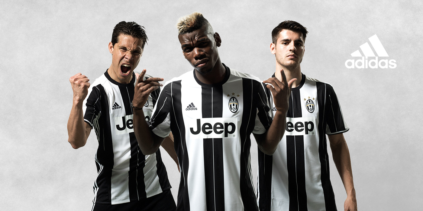
Adidas’ reign started out rocky at best this past season, but in their sophomore offering they took the opportunity to right the ship and crashed it directly into the pitch. After a series of leaks hinted at this abomination being christened the newest incarnation of Juventus F.C.’s beloved bianconero, it’s officially been unveiled today. I held out in hopes that it was a mistake, that it couldn’t be real, but I still wrote this piece well in advance, so I guess I knew it to be true all along (and living in America, people are going to keep asking me the same dumb questions either way).
Now before a barrage of comments beats it into the ground: yes, opinions on aesthetics are subjective. So then, by that admission, you’ll indulge mine.
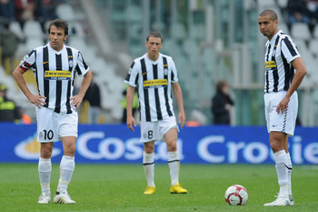
This awkward pinstripe / clunky rectangle hybrid we find ourselves with here fails on the very first basic parameter: just make the stripes the same size! It looks like the middle two black ones crashed together in the center like a trash compactor, leaving us, somehow, with four different stripe widths on the same torso at one time if you count the sides.

It looks less like an official kit and more like a bad counterfeit for which the bootlegger didn’t even try. It looks like someone rearranged Newcastle’s worst effort. It looks like someone tried to make tuxedo suspenders. It looks like a giant white H. For “Horrible.” It is bad, it is not good, and the ghosts of Notts Country would be disappointed to discover their legacy led to this. For this, the creator’s acronym now surely stands for “All Day I Design Awful Shirts.”
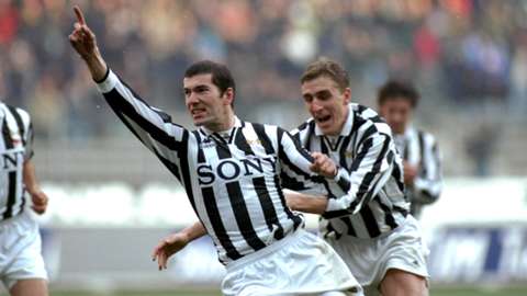
It’s clear that the glory days of well blended, simple, and full-bodied kits of the ‘90s and prior are done and dusted, but we’ve seen glimpses of class in recent years, namely Nike’s farewell in 2014-15, which saw a return of a collar atop a well-rounded and clean shirt. History shows any attempt to break the harmony of the stripes surrounding the jersey fail, like 2002-03’s weird rounded box effect, 2003-04’s stripes that seemed to give up entirely halfway down for some reason, and Adidas’ recent debut for us, which crammed a record number of stripes into one shirt but of different sizes and directions resulting in little more than cluttered confusion.
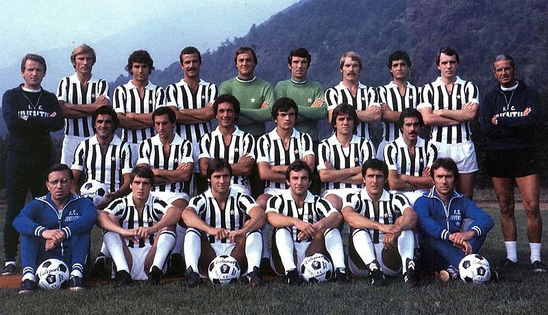
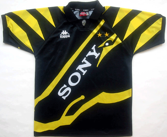
It feels uncomfortable to see such a beautiful club adorned with such disastrous uniforms. Sure, it’s not the ridiculous concepts of Napoli’s fake denim and not one but two camouflage laughs, but that’s the problem – our famous black and white history is an established and gorgeous one that deserves better. Even the grayscale preview placeholder design was easier on the eyes. Even typically “bad” examples like Kappa’s 1996-97 third kit are at least interesting and amazing even if only in a novelty sense. The only thing worse than this was that dark period in which we actually wore this solid neon green atrocity, but we don’t speak of that anymore.
People love to say that we always come to appreciate the shirts for what they represent on the pitch rather than their visual appearance, and in a way that’s true; if you win the Champions League in a burlap sack with lines drawn on it in crayon it’ll probably still hold more positive, lasting emotions than a pretty attractive jersey in which you bombed (looking at you, 2009-10). But though the current state of affairs means we may be on course for a sixth straight scudetto while wearing this (and it’s that good fortune that allows me to gripe about relative trivialities such as this), I can’t imagine Juventini ever looking back on it with anything more than a cringe, a laugh, and of course, a loving “Fino alla fine, forza Juventus!” all the same.
Kit image from Juventus.com


16 Comments
Q: Is it the worst 1st choice shirt design ever?
A: Yes.
If it’s not evenly spaced equal width black and white stripes it’s not Juve. End of.
You have to admit it didn’t look bad on the field today! The first adidas kit was strange for me at first, but now it is my favorite by far. All three kits are beautiful (my one reservation being the gold juventus logo on the black kit), not to mention buffon’s home kit! Adidas has done great work for juventus, and i’m sure come september, you will feel very different about this kit. There is a leaked blue away jersey which i’m not so sure about. If it turns out to be true, we will look a whole lot like chelsea next season. Here are my pogba, barzagli and laura barth kits. Buffon’s is on the way 🙂 forza juve!!
Not a fan either, but maybe it will get better when we are used to it? Maybe…
this is still my favourite
I loved the pink jersey with that black star all over it. 2012 away jersey if memory serves me right. And the white away jersey with the Italian tricolor from top to bottom in the centre was nice too. Cant recall when that one was used, before 2010 somewhere
No! I love it! To me it looks like a more modern take on the traditional. I think they had casual merchandising in mind when they designed it as it provides more opportunities for clothes you actually want to wear.
Re the casual thing – agreed
Can anybody answer this for me please. Why / what do Juve have both the roundel and shield in Italian tricolours for on their shirts? One or the other I can understand, not both. But doubtless there is a reason?
The shield is worn by the serie a champions. The roundel is worn by the coppa italia champions. At the moment, we are both things 🙂
Cheers.
You have to admit it didn’t look bad on the pitch today! I had my reservations about the first adidas kit, but with time it has become my favorite by far. Adidas did great work for us this year. I think all three kits are more streamlined and elegant than the nike kits (my one reservation being the golden juventus crest on the black kit), not to mention gigi’s home kit! I was not so happy with this kit when it leaked, but after seeing it in action today i’m sure that come september we will all feel different about it. There is a leak of a blue away kit which i’m not so sure about. If it turns out to be true, we will look a whole lot like chelsea next season. Here are my pogba, barzagli, and laura barth kits. I love them all. Buffon’s is on the way 🙂 Forza Juve!!
I actually liked this one. How unpopular my opinion might be I back it up with the argument that it looks different from recent years. Different is maybe not always good but I think that difference is necessary. This is also the first jersey that let’s the Jeep logo fade into the jersey. Earlier it looked as if they glued it on after they finished the whole thing. Just to finish my unpopular opinion, I’m also not a fan of collars.
Good day to you all lovely people from rainy Stockholm, Sweden.
Noticed the jeep logo too – it is the best so far. I am just not a fan of the varying width of the stripes.
I disagree wholeheartedly. It actually looked great on the pitch: far better than last year version. Actually, I can’t stand the narrow-striped versions that have been used on almost alternate seasons in the past. As for Notts county kits, take a look at these images. And as for the styles with collar, well … forget them. A collar on a soccer jersey simply looks stoopid!
Cant disagree more. I think the new kit designs are great. My favorite of all time has to be the strip which had stars on the shoulders and had airvents down each side. Classic kit that Del Piero became a great wearing.
The soon I saw the kit I thought it was one of the best kits ever. I really like it.
Comments are closed